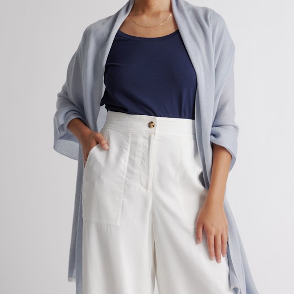
Neutrals
1. Soft navy and pale denim do the work black and camel do elsewhere.
A personal color journal by Diana Wallace
Soft blues, cool blush and sea-glass light: the palette I'm exploring, how I wear it, and a gentle tour of all twelve seasons.
Hi, I'm Diana. Trying colors near my face, I kept noticing that a soft, silvery blue and Heather Storm Blue looked better on me than deeper shades like burgundy. That small discovery turned into this journal. I identify with Light Summer, so it's the heart of this site, and I go deepest there. You'll also find every other season, because the best part of color is helping someone else find theirs.
Before we start: color seasons are a convention, a lovely shorthand for talking about color, not a scientific fact about anyone. Fabric, dye, screens and daylight all shift how a color looks. Try colors near your face by a window, keep what makes you happy, and please don't clear out your closet on my account.
The flagship season · Summer family
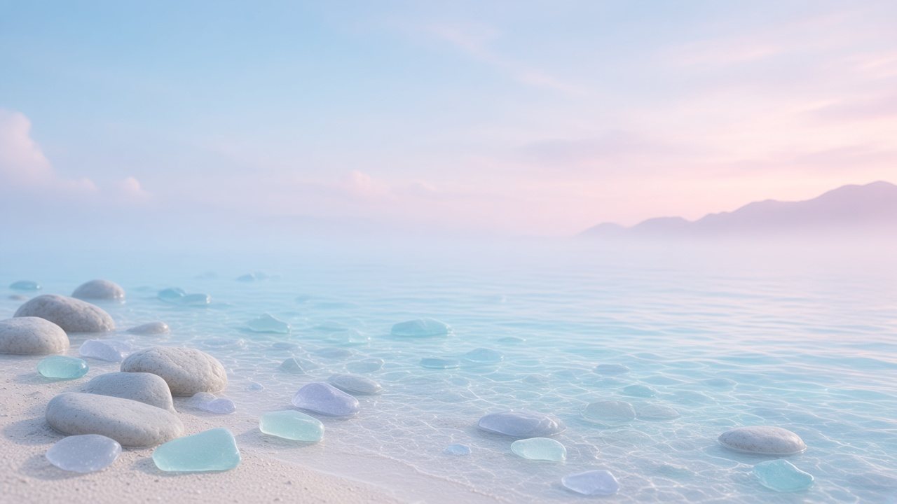
Light Summer feels like the sea at seven in the morning: powder blue, sea glass, a blush sky and soft white stone. The colors are light, they lean cool, and they stay gently clear rather than smoky.
The Light Summer palette
#F4F3EE#D9DADB#C9C1BC#B9BCC2#3E4C6E#A9BED3#B9D3EA#7F95BD#A8DAD4#AEB6E3#F1C9D2#E4A6BA#C9B8E0#BFE5CFApproximate on-screen colors. Fabric and daylight will vary.
“Soft blue at my face, navy as my anchor, cool blush for sweetness. That's the whole recipe, and it feels like me.”
Diana
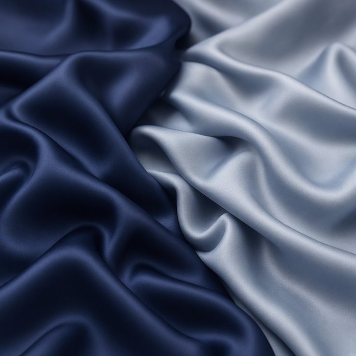
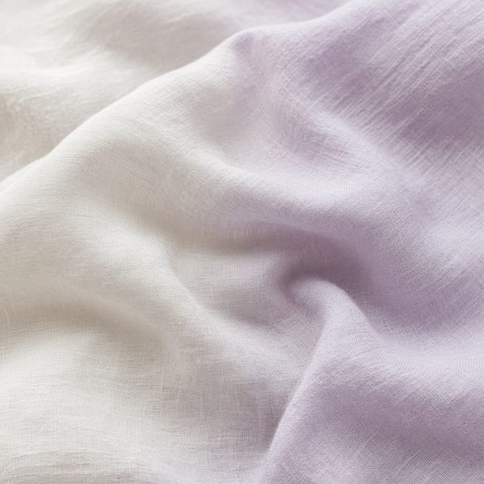
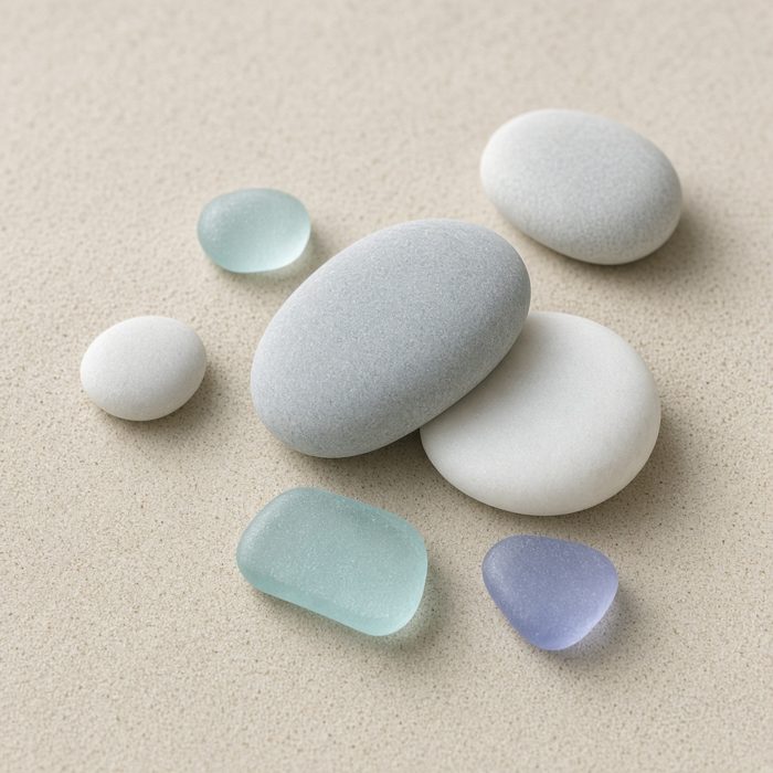
1. Soft navy and pale denim do the work black and camel do elsewhere.
2. Heather storm blue is my most flattering color so far.
3. Cool blush, never peach. Deeper raspberry stays away from my face.
4. Mint, jade and pale lemon in small doses, like a scarf or a tee.
Getting dressed
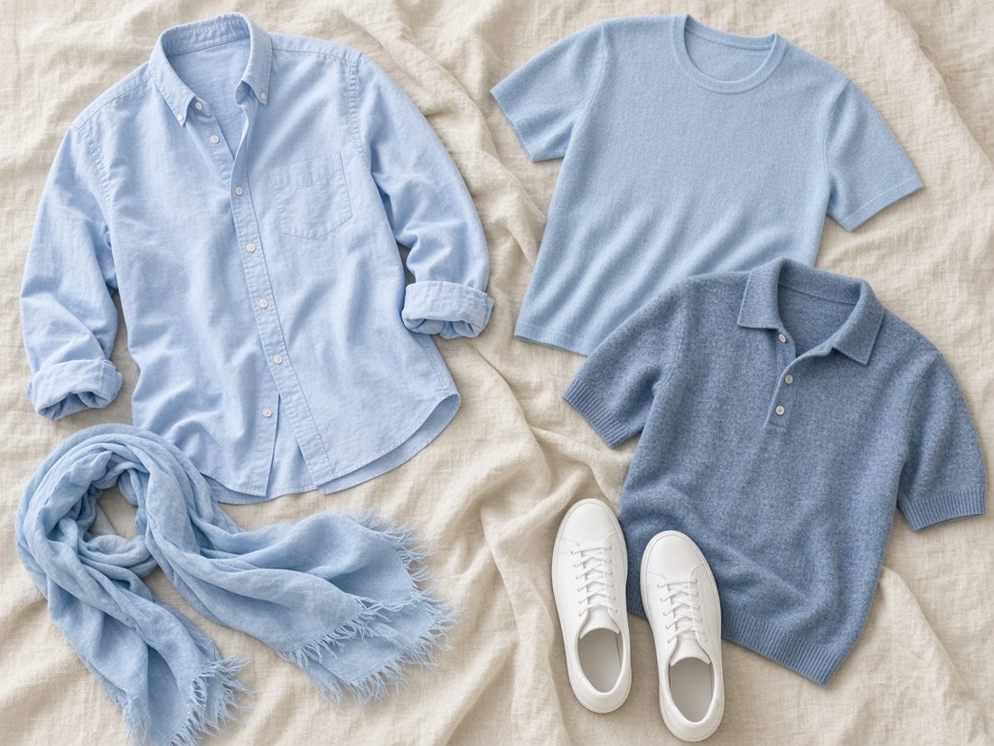
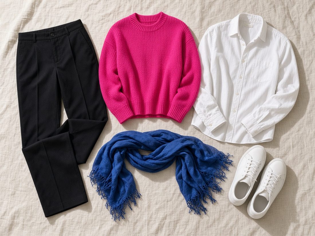
These are the formulas I actually reach for, laid out flat so you can see how the colors talk to each other.
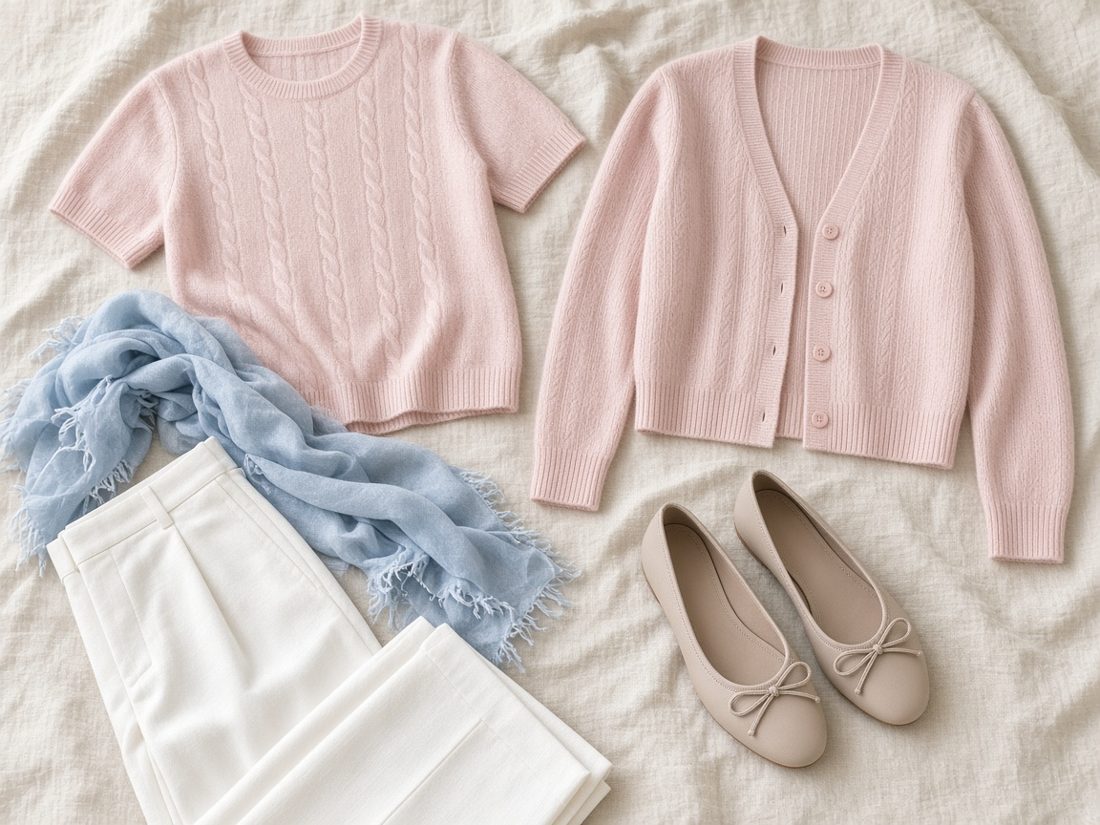
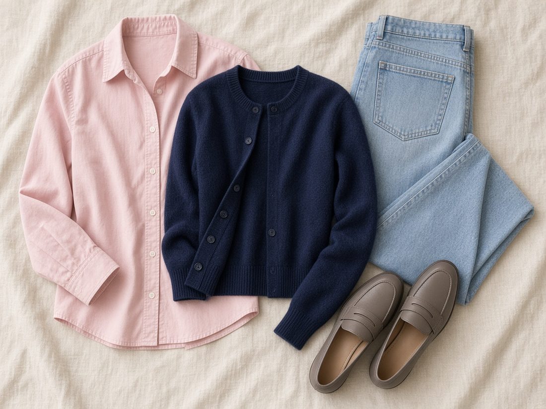
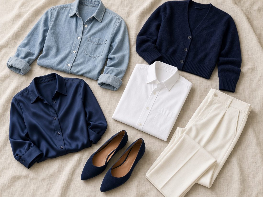
Fondant Pink cable tee, Fondant Pink cropped cardigan and my Light Blue frayed-edge scarf. A real twinset, with the soft blue at my face keeping the pink calm. That's outfit one above.
Shop the palette
Ten pieces in the blues, blush, navy and clean white I'm exploring, plus the scarf I already own.
I checked every colorway against the retailer's own photos, plus price, fiber and size S stock, on Friday, November 13, 2026. Prices and stock change, so check the product page before buying. Crossed-out figures are the comparison prices shown on the retailer's site. Product photos belong to Quince and link to each product page.
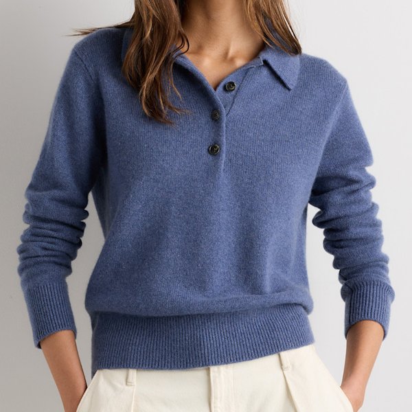
Heather Storm Blue
Mongolian Cashmere Button Polo Sweater
My most flattering blue so far. The button placket makes nursing easy.
Nursing-friendlyShop on quince.com
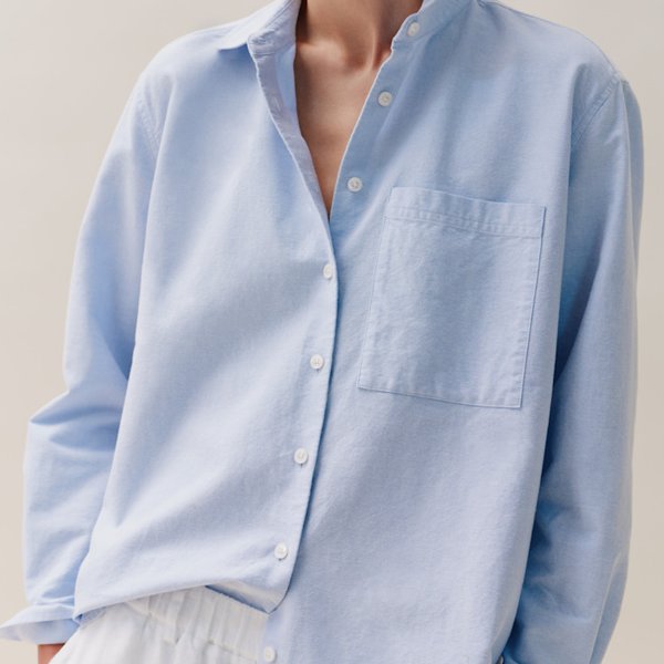
Pale Blue
Organic Cotton Relaxed Oxford Shirt
The silvery-blue I like best near my face, with a straight collar.
Nursing-friendlyShop on quince.com
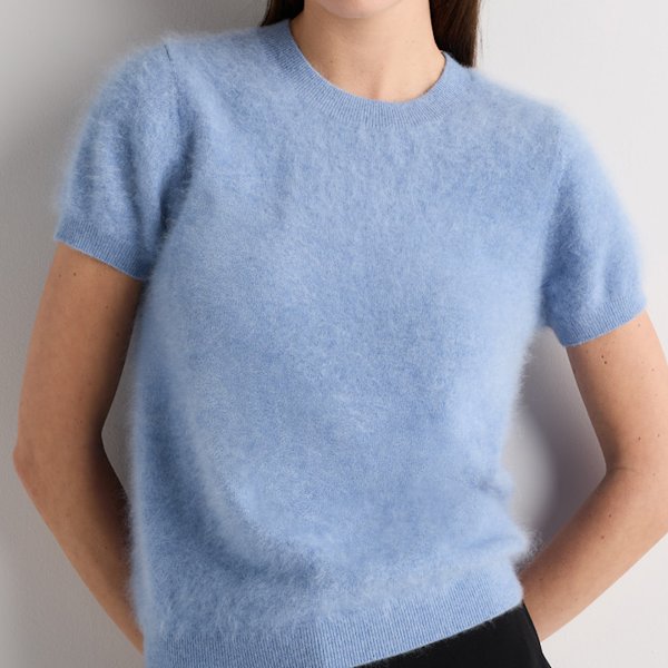
Faded Denim
Brushed Cashmere Tee
Reads like powder blue. It is a pullover, so I wear it under an open cardigan.
PulloverShop on quince.com
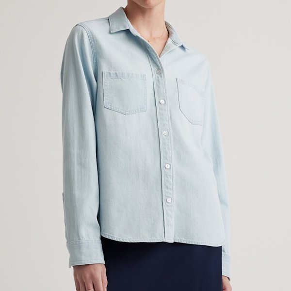
Light Chambray
Distressed Denim Shirt
Washed-out icy blue in real denim; buttons all the way down.
Nursing-friendlyShop on quince.com
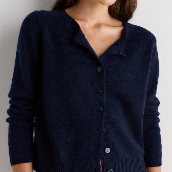
True Navy
Mongolian Cashmere Cropped Crew Cardigan
My anchor. A clean navy is softer than black near my face.
Nursing-friendlyShop on quince.com
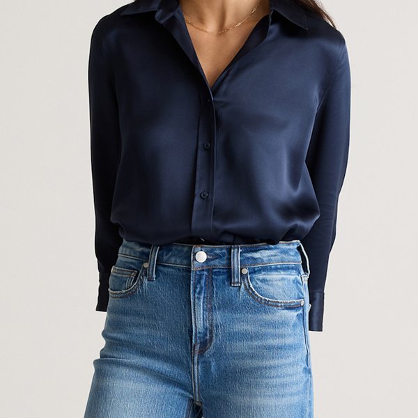
Navy
Washable Silk Three-Quarter Sleeve Shirt
Grown-up and dressy; I keep the rest of the outfit matte.
Nursing-friendlyShop on quince.com
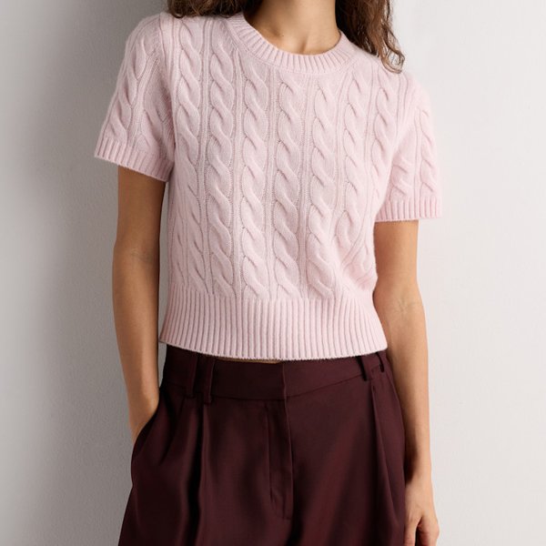
Fondant Pink
Mongolian Cashmere Shrunken Cable Tee
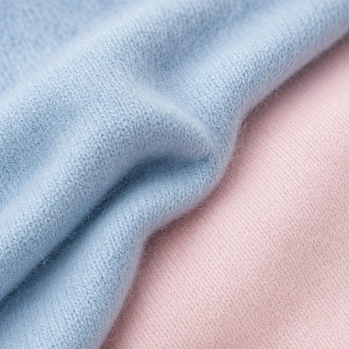
A pale, cool blush with no peach in it. Half of my matching set.
PulloverShop on quince.com
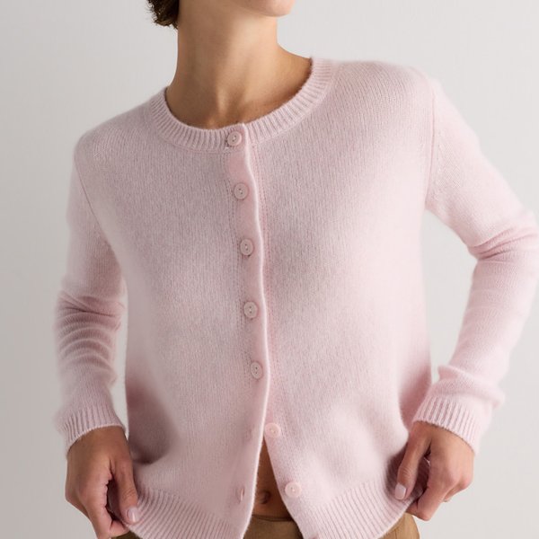
Fondant Pink
Mongolian Cashmere Cropped Crew Cardigan
The other half of the twinset; opens fully.
Nursing-friendlyShop on quince.com
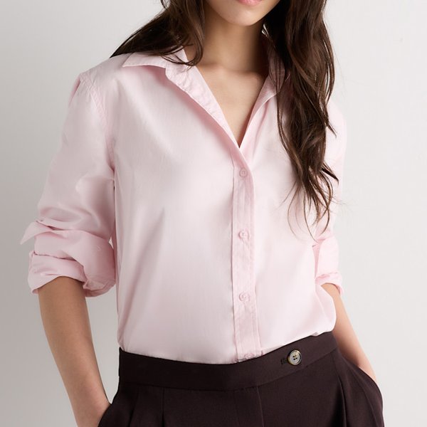
Fondant Pink
Organic Cotton Poplin Long Sleeve Shirt
The same cool blush in crisp cotton, with a straight collar.
Nursing-friendlyShop on quince.com
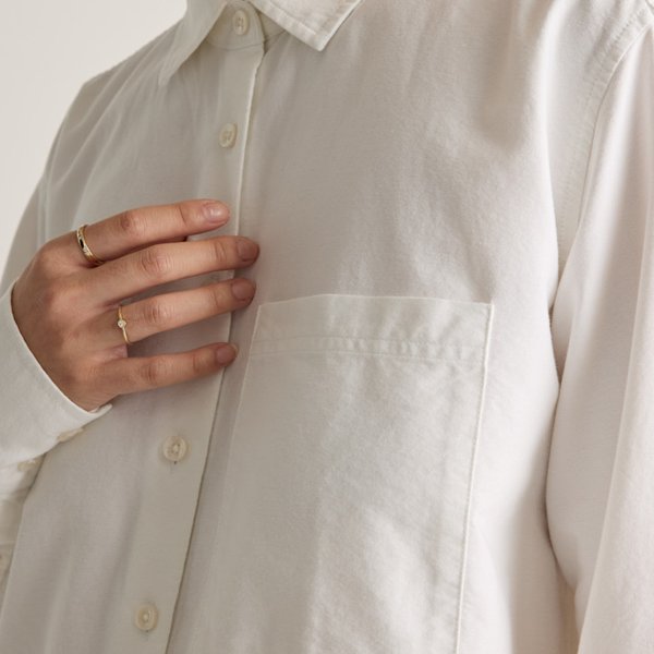
White
Organic Cotton Relaxed Oxford Shirt
A clean white with no yellow cast; I soften it with blue or blush.
Nursing-friendlyShop on quince.com
The ten pieces total $694.30 at the prices listed on November 13, 2026.
Edited out
Not bad colors, just not the ones I'm reaching for in this palette right now.
The twelve seasons
The twelve-season system sorts colors by three qualities: light or deep, warm or cool, clear or soft. Think of each season as a neighborhood rather than a fence. Plenty of people live near a border.
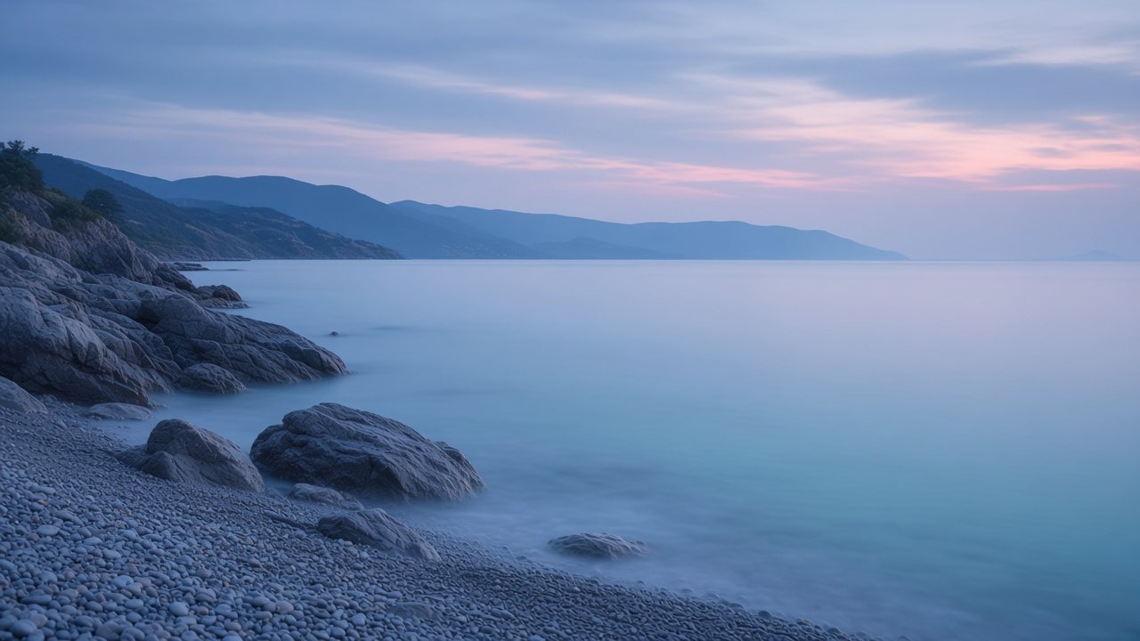
Summer · Also called True Summer
The coolest of the Summers: blue-based, medium-light and calmly elegant.
The Cool Summer palette
#F1F1EE#9EA3AB#7C8A9E#5D6878#36456A#8C6E73#7E9CD6#C24E7A#D98AA8#4D8A8C#8A6A9E#8F98D6#A9C3E0#B9A6D3Approximate on-screen colors. Fabric and daylight will vary.
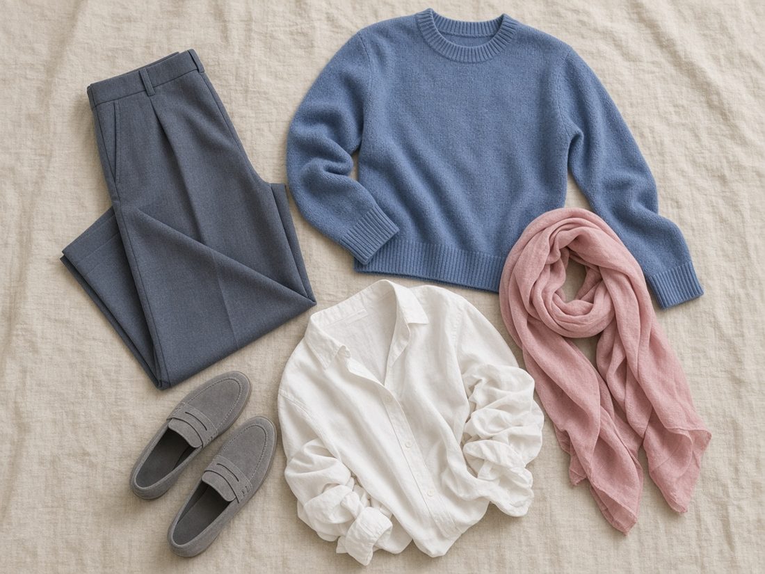
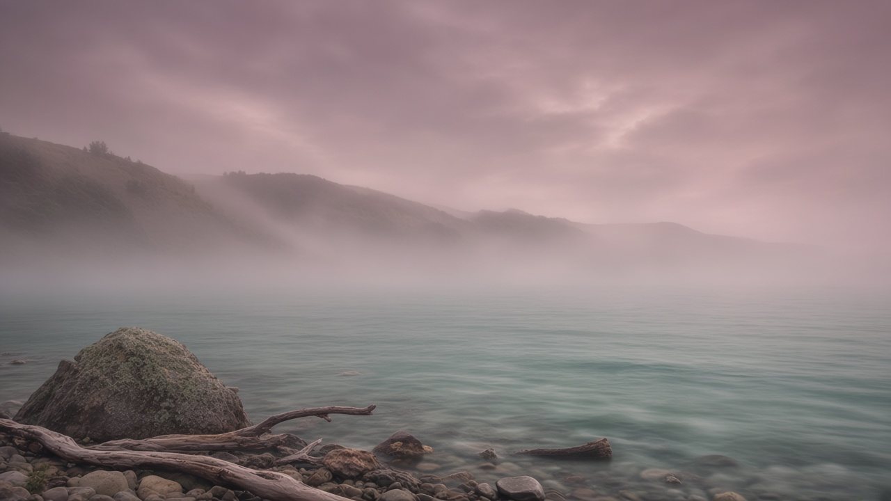
Summer · Sometimes called Muted Summer
Smoky, gentle and cool-neutral, like sea fog over gray-green water.
The Soft Summer palette
#E6E1D8#B4A99F#8E9094#4F5763#7D7068#7B8EA6#8DA2B8#A3B19A#B28C9E#C99BA4#7D6278#6E9A99#8CB3A2#A79DB8Approximate on-screen colors. Fabric and daylight will vary.
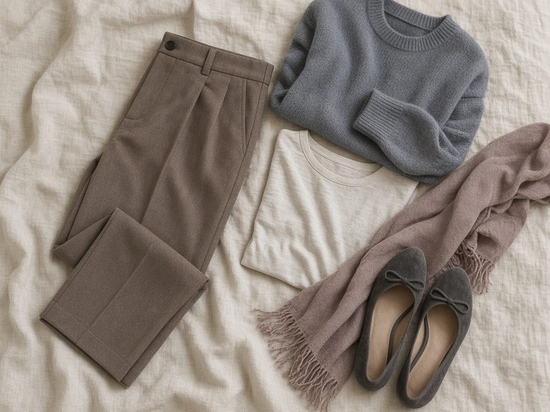

Spring · Sometimes called Light Warm
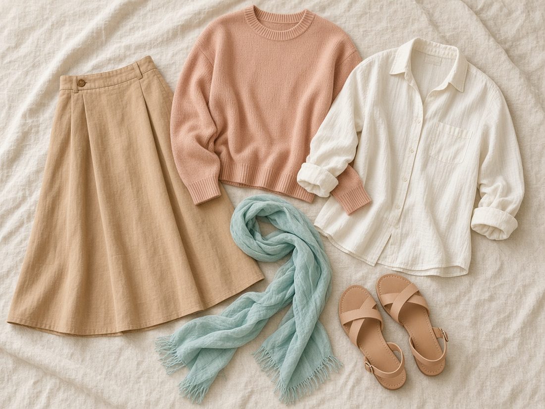
Light and warm-leaning, with a fresh, sunlit clarity.
The Light Spring palette
#F7F1E3#D8BE98#E3D2B8#C9BD9A#C8C3BA#4A5A80#F6BFA0#F29B8A#7FD3C9#F6E08E#B6E6C4#9FAEE3#F4B07E#F4A3B4Approximate on-screen colors. Fabric and daylight will vary.

Spring · Also called True Spring
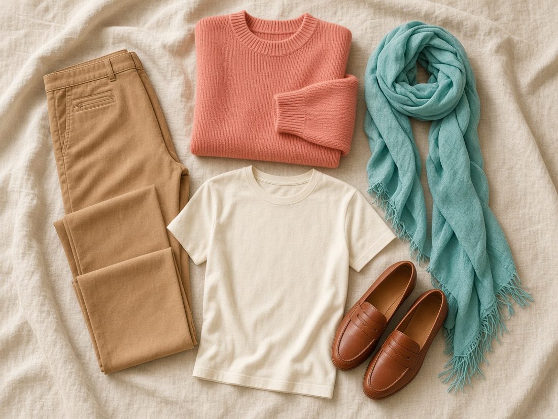
The warmest Spring: golden, fresh and lively.
The Warm Spring palette
#F6EEDB#C69C6D#D9BD8F#A28B72#8A5A3C#34466E#F07E64#33B5B0#F2C14E#78B657#E2543E#62CBC0#F4A261#8F6FC2Approximate on-screen colors. Fabric and daylight will vary.
Spring · Also called Clear Spring
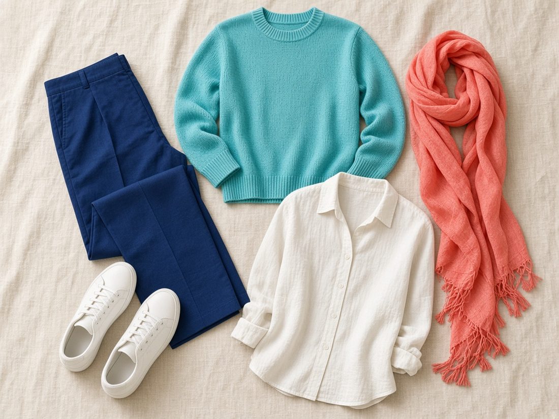
Clear, vivid and warm-neutral, with crisp contrast.
The Bright Spring palette
#FAF6EC#BEB8AE#3F3F44#23356E#9C8A78#5A3B2E#14B8B0#FF6F5E#F25C8A#2EA14E#2F7FD8#F7D33C#E8392F#7E4FD6Approximate on-screen colors. Fabric and daylight will vary.
Autumn · Sometimes called Muted Autumn
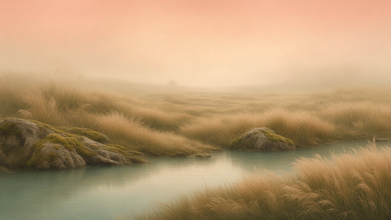
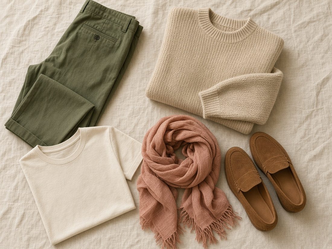
Warm-neutral and hazy, like dry grasses in golden fog.
The Soft Autumn palette
#EFE6D2#D6C7AC#B89A72#9A8A76#6F6247#5B5853#A3AC88#7F8358#D69B84#5E8F8A#DDB094#B7A779#B98582#C9A968Approximate on-screen colors. Fabric and daylight will vary.
Autumn · Also called True Autumn
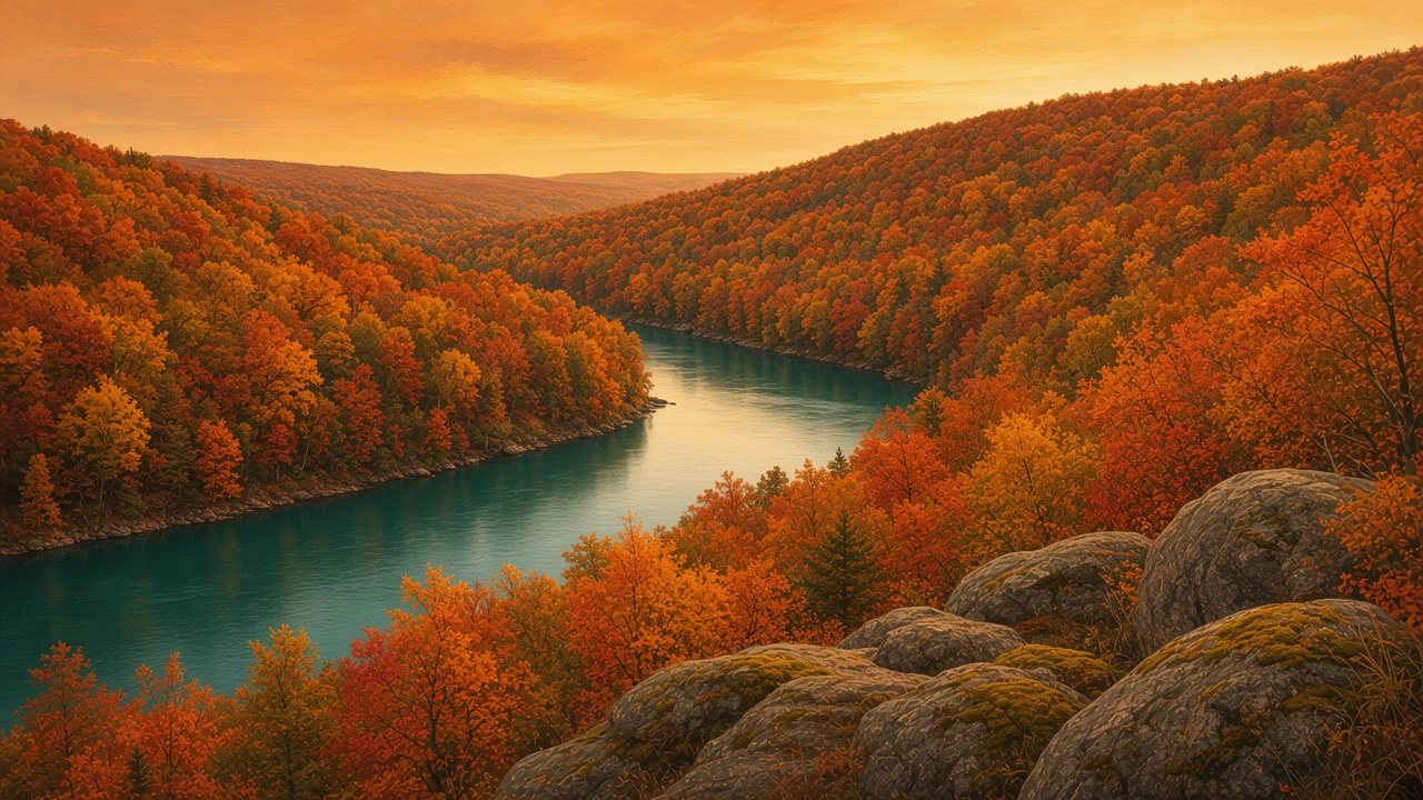
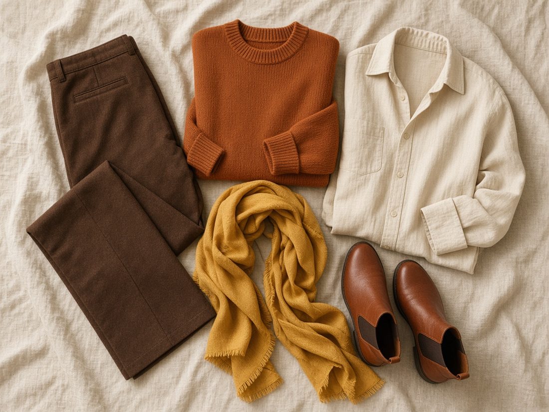
Rich, warm and earthy, like a river valley in October.
The Warm Autumn palette
#F1E4C8#B98B57#5A3A27#6B6B3A#A8955F#8C6A3C#B2532E#D9782D#D1A33A#2F7F7A#5E7A3A#C2694A#9E3B2C#D6A24AApproximate on-screen colors. Fabric and daylight will vary.
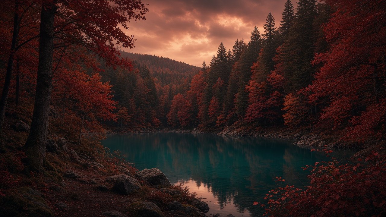
Autumn · Also called Dark Autumn
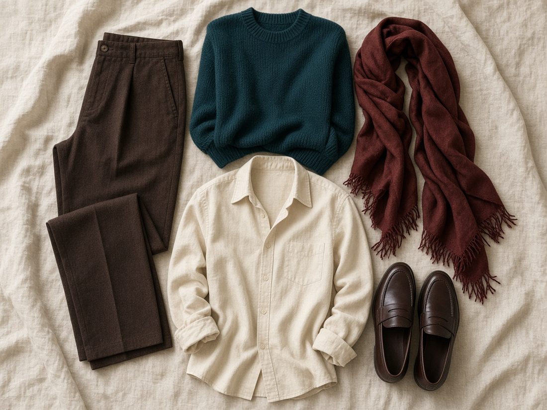
Deep and warm-neutral, like evergreen woods at dusk.
The Deep Autumn palette
#EFE3CC#3E2A21#2E2420#4E4F2C#7E5B34#3D3A36#6E1F24#145A5C#2D5236#7A2638#B0643A#A8432C#B58A2A#4E2C40Approximate on-screen colors. Fabric and daylight will vary.
Winter · Also called Dark Winter
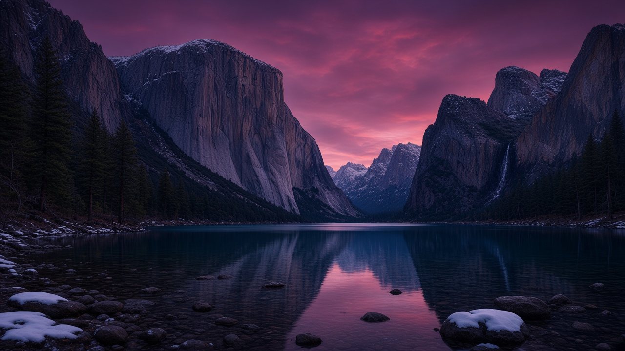
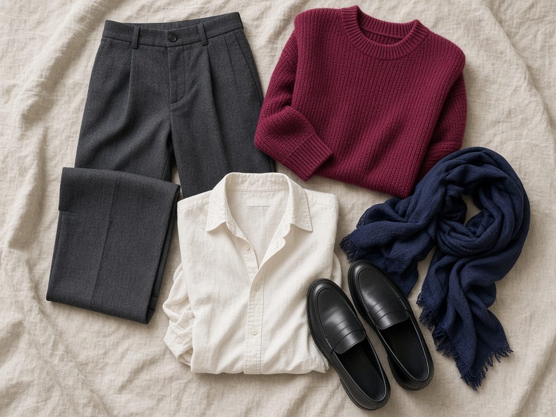
Deep and cool-neutral, with dramatic, inky contrast.
The Deep Winter palette
#F2F1EE#1C1C1E#36373C#1F2A44#5A4E4A#1F3B33#8E2752#5E2A55#6E1E33#11604A#1F4A9C#B0203A#0F5560#6A3D8FApproximate on-screen colors. Fabric and daylight will vary.

Winter · Also called True Winter
The coolest Winter: icy, crisp and high contrast.
The Cool Winter palette
#FBFBFB#141416#3A3D44#1C2B5A#8D929B#D9DEE5#2847B8#C5267A#11845B#CFE6F5#C21F3A#F6D7E6#5B3BAA#1F4D3AApproximate on-screen colors. Fabric and daylight will vary.
Winter · Also called Clear Winter
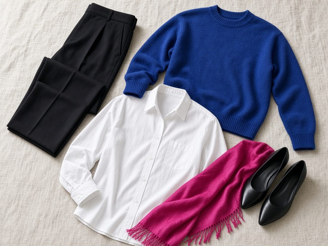
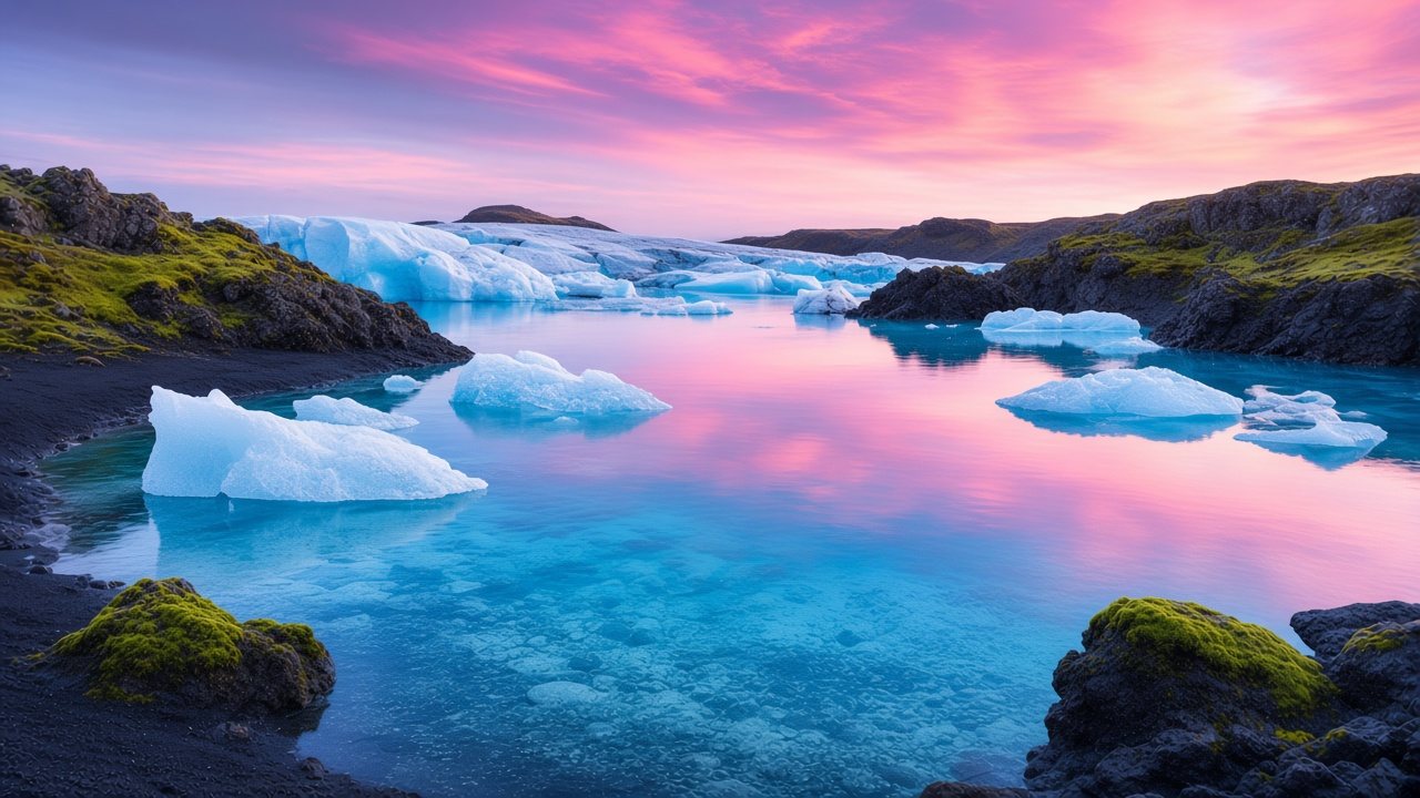
Vivid and cool-neutral, like ice and sunset on a glacier lagoon.
The Bright Winter palette
#FFFFFF#121214#34353A#1A2C6B#7E7570#DADFE6#1D4FC4#0FB5C2#E8338A#7A3FD1#0F9A64#D81E36#C8EEF0#F4E04DApproximate on-screen colors. Fabric and daylight will vary.
I'm Diana, and Light Summer is the palette I'm exploring and identify with. This is my own personal guide, written and designed by me. The nature scenes, flat-lays and textures are original images made for this site. The palette charts are my own approximations of each season, informed by common twelve-season references.
This is an independent project. I'm not affiliated with, sponsored by or endorsed by Quince, Dream Wardrobe or any brand mentioned here. Product names, photos and prices belong to their owners and link to the original product pages.