
Spring · Also called Clear Spring
Bright Spring
Clear, vivid and warm-neutral, with crisp contrast.
- Value
- Medium, high contrast
- Temperature
- Warm-neutral
- Chroma
- Very clear
The Bright Spring palette
#FAF6EC#BEB8AE#3F3F44#23356E#9C8A78#5A3B2E#14B8B0#FF6F5E#F25C8A#2EA14E#2F7FD8#F7D33C#E8392F#7E4FD6Approximate on-screen colors. Fabric and daylight will vary.
How to wear it
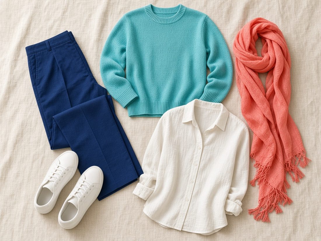
- Contrast is welcome: a bright accent against navy or charcoal looks deliberate.
- One clear color near the face does more than several at once.
- Polished gold or bright silver both work; shine suits this season.
Next-door seasons
- Warm Spring. Warm Spring is warmer and a little less intense.
- Bright Winter. Bright Winter is just as vivid but cooler, with icy brights and black.
- Light Spring. Light Spring is lighter and gentler.
Remember: color seasons are a convention, not a scientific fact about anyone. Fabric, dye, screens and daylight all shift how a color looks.
About this site
I'm Diana, and Light Summer is my palette. This is my own personal guide, written and designed by me. The nature scenes, flat-lays and textures are original images made for this site. The palette charts are my own approximations of each season, informed by common twelve-season references.
This is an independent project. I'm not affiliated with, sponsored by or endorsed by Quince, Dream Wardrobe or any brand mentioned here. Product names, photos and prices belong to their owners and link to the original product pages.