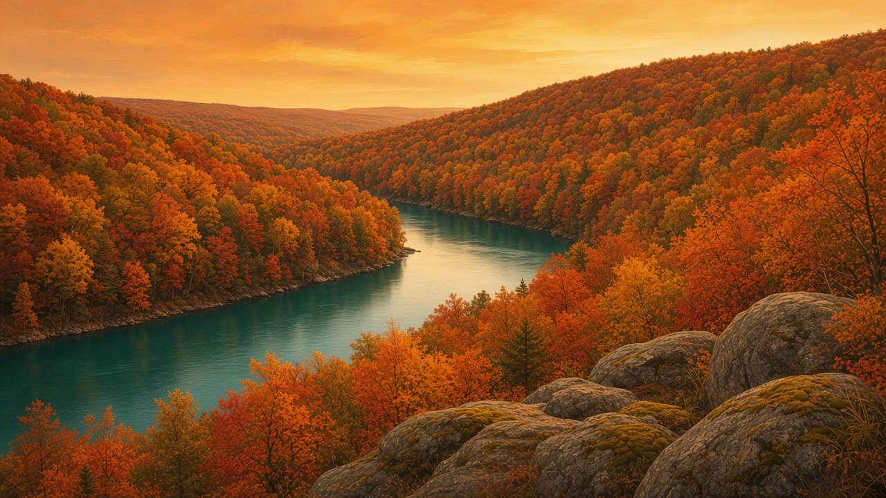
Autumn · Also called True Autumn
Warm Autumn
Rich, warm and earthy, like a river valley in October.
- Value
- Medium to deep
- Temperature
- Warm
- Chroma
- Moderately muted
The Warm Autumn palette
#F1E4C8#B98B57#5A3A27#6B6B3A#A8955F#8C6A3C#B2532E#D9782D#D1A33A#2F7F7A#5E7A3A#C2694A#9E3B2C#D6A24AApproximate on-screen colors. Fabric and daylight will vary.
How to wear it
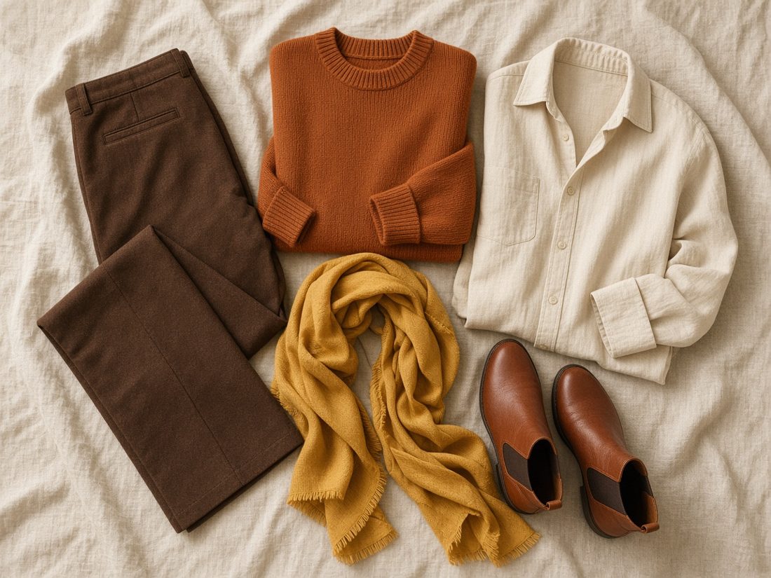
- Camel, chocolate and olive are the everyday base.
- Rust, pumpkin or warm teal make strong accents.
- Yellow gold, copper and tortoiseshell feel at home here.
Next-door seasons
- Soft Autumn. Soft Autumn is lighter and more hazy.
- Deep Autumn. Deep Autumn is deeper, with more contrast.
- Warm Spring. Warm Spring shares the warmth but is lighter and clearer.
Remember: color seasons are a convention, not a scientific fact about anyone. Fabric, dye, screens and daylight all shift how a color looks.
About this site
I'm Diana, and Light Summer is my palette. This is my own personal guide, written and designed by me. The nature scenes, flat-lays and textures are original images made for this site. The palette charts are my own approximations of each season, informed by common twelve-season references.
This is an independent project. I'm not affiliated with, sponsored by or endorsed by Quince, Dream Wardrobe or any brand mentioned here. Product names, photos and prices belong to their owners and link to the original product pages.